Representing data visually
Presenting content in an alternative format such as a visual representation, rather than through text alone, can support students to understand and interpret data, complex concepts or abstract ideas. When using charts, graphs, infographics and other visual representations, the challenges presented for some students accessing and interpreting them should always be considered. For example:
- Students with a poor internet connection may be unable to load high-resolution images.
- Students may be accessing the content on a small device that does not have enough screen space to display the full image.
- Students with vision impairments may not be able to interpret the data visually.
- Students with cognitive or learning disabilities may require support to interpret visualisations such as charts or infographics.
This article outlines some simple tips you can implement to make sure the visual representations you add to your subject site are optimised for use by all students.
How?
Adding charts, graphs and infographics to your subject site
Instructions to upload your chart or graph as an image are available in the L&T Hub article, Adding images.
Making visual content accessible to all students
Provide a Description
Explain the data in a clearly labelled description that summarises the key message or story displayed in the data. This will benefit students who are unable to load, access or see the image as well as those who require support interpreting visualisations.
Provide data in multiple formats
Where practical, consider providing the data in multiple formats, e.g., a graph and a supporting data table.
Label graphs to highlight key data
Ensure your visualisation is clearly labelled so that key data is easy to find.
Example
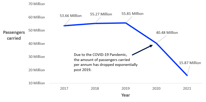
The examples below showcase some of the strategies which have been outlined throughout the article. Particularly, showing the data in multiple formats and clearly labelling the context of the data within the graphical representations.
Qantas Annual Report 2021 - Five Year History
In the years preceding the COVID-19 pandemic, Qantas was experiencing consistent growth, but from 2020, the company has experienced a rapid decline in the number of passengers travelling. 
| Qantas Annual Report 2021 - Five Year History | |
| Year | Passengers Carried |
| 2017 | 53.65 million |
| 2018 | 55.27 million |
| 2019 | 55.81 million |
| 2020 | 40.47 million |
| 2021 | 15.86 million |
References
Qantas (2021). Qantas Annual Report 2021. https://investor.qantas.com/FormBuilder/_Resource/_module/doLLG5ufYkCyEPjF1tpgyw/file/annual-reports/2021-Annual-Report.pdf


